
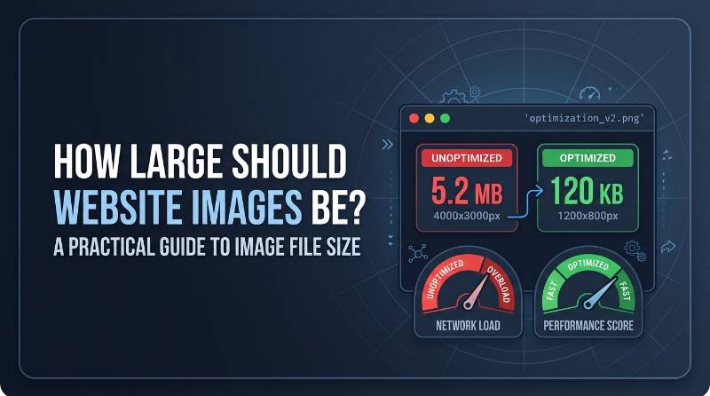
How Large Should Website Images Be? A Practical Guide to Image File Size
You download a photo from a stock site or take a shot with a modern smartphone, and the image looks crisp, vibrant, and perfectly sharp on your screen. You upload it to your website, but behind the scenes, that single file might be 4000 pixels wide and take up 5 megabytes of storage. To a visitor on a desktop screen, it might look no different than an image a quarter of its size, but to their internet connection, it requires downloading millions of unnecessary data points. Understanding how to manage website image size comes down to balancing two very different properties: pixel dimensions and file size.
What Does "Image Size" Mean on a Website?
When people talk about image size on the web, they are usually blurring four distinct concepts together:
- Pixel dimensions: The actual width and height of the image measured in pixels, such as 1920×1080. This determines how much detail the file contains.
- File size: The amount of disk space the image occupies, measured in kilobytes (KB) or megabytes (MB). This dictates how long the browser takes to download the file.
- Displayed size: The actual dimensions the image occupies on the screen, controlled by HTML and CSS layout rules.
- Compression quality: The mathematical efficiency used to encode the image data, which affects both visual clarity and file weight.
Consider a simple comparison: A raw photograph straight from a camera might measure 6000×4000 pixels and take up 12 MB on disk. If your blog content area is only 800 pixels wide, the visitor's browser will scale that massive image down to fit the 800-pixel slot. The user sees an 800-pixel-wide graphic, but their phone still had to download all 12 MB of data. Conversely, taking that same photograph, resizing its pixel dimensions to 1200×800 pixels, and applying standard compression drops the file size to roughly 120 KB—a 99% reduction in downloaded data with no visible loss in display quality.
How Large Should a Website Image Be?
There is no single universal file size rule for every image on the internet. A simple two-color vector logo has vastly different requirements than a detailed high-resolution hero background. However, target file-size ranges provide a reliable benchmark for web performance:
- Blog content images: Aim for 70 KB to 200 KB. Detailed screenshots or complex photographs may occasionally reach 250 KB, but simpler graphics should stay well below 100 KB.
- Featured images: Target 100 KB to 250 KB. Because these often span wider display areas or serve as header graphics, slightly higher sizes are expected.
- Thumbnails: Keep between 10 KB and 50 KB. Pages listing multiple post thumbnails need to load quickly without piling up background weight.
- Logos and UI icons: Keep under 20 KB. SVG format is preferred for logos and icons, as SVG files are text-based vector paths that scale infinitely while using minimal data.
- Screenshots: Aim for 50 KB to 150 KB. Screenshots contain flat colors and sharp text, which respond well to specific compression formats.
- Full-width hero/banner images: Target 150 KB to 350 KB. Broad background photos covering the entire screen width demand larger dimensions, but aggressive compression should prevent them from exceeding 400 KB.
Recommended Image Dimensions for Common Website Uses
Dimensions should be selected based on the widest container the image will fill in your site's layout, taking high-density displays (such as Retina screens) into account.
| Image Role | Recommended Width (Pixels) | Recommended Height (Pixels) | Typical Target File Size |
|---|---|---|---|
| Standard Blog Post Image | 800px – 1200px | Auto / Proportionate | 70 KB – 180 KB |
| Featured Header Image | 1200px – 1600px | 630px – 900px | 100 KB – 250 KB |
| Full-Width Desktop Hero | 1920px – 2560px | 800px – 1080px | 150 KB – 350 KB |
| Social Open Graph Share | 1200px | 630px | 100 KB – 200 KB |
| E-commerce Product Detail | 1000px – 1500px | 1000px – 1500px (1:1) | 80 KB – 200 KB |
| Grid Thumbnail | 300px – 600px | 300px – 600px | 15 KB – 50 KB |
| User Avatar / Profile | 150px – 300px | 150px – 300px (1:1) | 10 KB – 30 KB |
| Site Logo (Raster/PNG) | 250px – 500px | Auto / Proportionate | 10 KB – 35 KB |
These values serve as starting recommendations. Responsive layouts automatically adjust how images appear across screen sizes, so uploading an image wider than your main content container's maximum width rarely yields a visible benefit.
Why Uploading a Huge Image Can Slow Down a Website
When a browser requests a web page, it downloads the HTML structure, CSS files, JavaScript scripts, and media assets. Media assets typically account for more than half of a web page's total transfer weight. Uploading unoptimized photos impacts site performance in three distinct ways:
First, transferring unnecessary bytes over the network increases load duration, especially for visitors on mobile data or unstable connections. A 5 MB image downloaded over a standard mobile connection creates a noticeable delay during which the user waits for visual content to render.
Second, large images strain device hardware. Once a browser downloads a compressed file, it must decompress the image data into raw memory to display it on screen. A 24-megapixel photo (6000×4000 pixels) consumes nearly 100 megabytes of RAM when uncompressed in system memory, regardless of whether the file was compressed to 500 KB on disk. On lower-end mobile devices, decoding multiple oversized images causes scrolling stutter, browser lag, and increased battery consumption.
Third, oversized graphics harm core user experience metrics. If a hero image takes several seconds to load, elements on the page may shift unexpectedly, or the main content may take too long to present itself to the visitor.
Image Dimensions vs File Size: Which One Matters More?
Dimensions and file size are tightly linked, but they address different aspects of web optimization. Neither metric alone dictates whether an image is properly optimized.
Consider an uncompressed PNG image saved at 1200×800 pixels containing intricate color patterns; it might weigh 1.2 MB. Conversely, a large background photograph measuring 2500×1600 pixels saved as a heavily compressed WebP file might occupy only 180 KB. In this scenario, the image with larger physical dimensions delivers a much lighter network payload.
Dimensions define visual resolution limits and memory footprint during rendering. File size dictates network transmission speed. You must optimize both: first scale the pixel dimensions to match the display layout, then apply appropriate file compression to minimize weight.
What Is a Good File Size for a Blog Image?
For standard editorial blog posts, aim to keep individual body images under 150 KB whenever possible, with a strict ceiling of 200 KB for complex visual content. Simple diagrams or basic screenshots should comfortably fit within 40 KB to 80 KB.
Content type dictates what is achievable. A detailed photographic shot of a landscape with intricate foliage contains thousands of unique color shifts that resist heavy compression. Forcing that photo down to 40 KB might introduce visible pixelation or color banding. On the hand, a clean software interface screenshot consisting of flat grey backgrounds, black text, and crisp borders can easily be saved at 1200 pixels wide while remaining under 60 KB without losing clarity.
Focus on maintaining visual integrity while shedding hidden data. The goal is to eliminate unneeded pixels and metadata without making the image look muddy, blurry, or washed out.
How Image Format Changes File Size
Choosing the correct file extension is one of the easiest ways to drop file size without sacrificing clarity. Modern web design relies on four main image formats:
JPEG: Best for traditional photography and images with complex color gradients. JPEG uses lossy compression that effectively reduces file size by discarding fine visual details that the human eye barely notices. It does not support transparency.
PNG: Best for images requiring crisp line art, text overlays, or transparent backgrounds. PNG uses lossless compression, preserving every single pixel exactly as rendered. Using PNG for complex photographic shots yields unnecessarily massive file sizes, but for UI graphics and semi-transparent logos, it remains a standard choice.
WebP: A modern web image format developed to replace both JPEG and PNG. WebP supports both lossy and lossless compression, along with file transparency. A WebP photo is typically 25% to 35% smaller than an equivalent JPEG file at the same perceived visual quality.
AVIF: An advanced next-generation format offering even higher compression efficiency than WebP. AVIF excels at compressing complex photographic images down to tiny file sizes. While modern browser support is widespread, fallback configurations or automated optimization plugins are recommended to ensure compatibility with older devices.
How Much Should You Resize an Image Before Uploading?
Before compressing an image, resize its pixel dimensions to fit its display layout. If your content column is 750 pixels wide on desktop monitors, uploading a 4000-pixel image forces the visitor's device to process more than five times the resolution required by the screen layout.
To account for high-density displays (such as Apple Retina screens, which pack double the pixel density into the same physical screen area), target a target width roughly 1.5 to 2 times your layout container's display size. If your content area maxes out at 750 pixels, uploading an image resized to 1200 or 1500 pixels wide provides sharp detail on high-density screens without adding the weight of a full 4000-pixel camera output.
Should You Compress Images Before Uploading?
Yes, compression should always be applied before or during the upload process. Image compression works through two primary mechanisms:
- Lossless compression: Removes internal file metadata, EXIF camera details, color profile profiles, and unnecessary code without changing a single pixel of the visual graphic. This typically reduces file size by 5% to 15%.
- Lossy compression: Selectively simplifies tiny details and subtle color variations that are difficult for the human eye to detect. When done correctly, lossy compression can reduce file size by 50% to 80% with zero noticeable change in appearance.
When setting compression levels in image editing tools or optimization plugins, target a quality range between 75% and 85%. Dropping quality below 70% often introduces visual artifacts, fuzzy edges around text, and blotchy color patches. Setting quality to 100% generates huge file sizes for visual improvements that readers cannot actually see.
How Large Should a Featured Image Be?
Featured images require special attention because they perform double duty. They act as prominent page headers on your site and also serve as preview thumbnails when your link is shared on social networks or messaging apps.
Social media platforms recommend a 1.91:1 aspect ratio for preview cards, with 1200×630 pixels being the standard recommended baseline. This dimension works across desktop blog headers and social feeds. When compressed as a WebP or JPEG file, a 1200×630 featured image should fall between 100 KB and 200 KB.
Keep key focal elements centered within the frame so that if your website theme crops the graphic into a square or tall thumbnail on archive pages, the primary subject remains visible.
How Large Should Mobile Website Images Be?
Mobile devices account for a significant portion of web traffic globally, often operating on cellular connections with higher latency than home broadbands. Serving massive desktop-sized graphics to a smartphone screen wastes data and slows down page rendering.
Modern web platforms solve this through responsive image markup using the HTML srcset attribute. This attribute provides the browser with a list of different-sized versions of the same image, allowing a smartphone with a 390-pixel-wide screen to request a 600-pixel version while a desktop monitor requests the 1400-pixel version.
If your system does not generate responsive variants automatically, ensure your primary images are sized to moderate dimensions so mobile users do not suffer long load times for content they only view on a small screen.
What Happens If an Image Is Too Small?
While reducing file size is vital for performance, shrinking image dimensions too far creates its own set of visual problems:
- Blurriness and pixelation: Uploading a 400-pixel graphic to fill an 800-pixel content box forces the browser to stretch the pixels, resulting in fuzzy text and blurry visuals.
- Stretched aspect ratios: Scaling an image disproportionately distorts objects, faces, and text elements.
- Unprofessional appearance: Highly compressed or undersized graphics undermine trust, making a business or publication look unpolished.
It is always better to increase file size slightly by keeping higher dimensions than to publish a distorted visual asset that harms user trust.
How to Choose the Right Image Size Before Uploading
To establish a quick workflow for every image you publish, follow this practical checklist:
- Determine display placement: Identify where the image will sit on your page (such as content body, featured header, or grid thumbnail).
- Find maximum display width: Check your theme layout's maximum content width (for example, 800 pixels).
- Resize target dimensions: Scale the image width to approximately 1.5 to 2 times that display size (for example, 1200 pixels).
- Select format: Choose WebP or JPEG for photography; choose WebP or PNG for line art, screenshots, and graphics requiring transparency; use SVG for simple vector logos.
- Apply compression: Export the file at 75% to 85% visual quality.
- Verify visual output: Inspect the image at 100% zoom level to verify that lines remain clean and textures are free of compression blotches.
- Upload and verify: Confirm the final file size sits within your target range before publishing the page.
Practical Website Image Size Examples
To help visualize these rules, review these common real-world scenarios:
Standard Blog Content Image: A photograph embedded inside an article text block. Target Dimensions: 1200×800 pixels. Format: WebP or JPEG. Target File Size: 80 KB – 140 KB.
Full-Width Homepage Hero: A broad background image across the top of a landing page. Target Dimensions: 1920×1080 pixels. Format: WebP or JPEG. Target File Size: 180 KB – 300 KB.
Software Interface Screenshot: A screenshot explaining digital application settings. Target Dimensions: 1200×750 pixels. Format: WebP or PNG. Target File Size: 50 KB – 110 KB.
E-commerce Product Photo: A clean product photograph on a white background with zoom capabilities. Target Dimensions: 1200×1200 pixels. Format: WebP or JPEG. Target File Size: 90 KB – 160 KB.
Transparent Header Logo: A company logo displayed on a colored header bar. Target Dimensions: SVG vector format, or standard raster PNG at 400×120 pixels. Format: SVG or PNG. Target File Size: Under 25 KB.
How to Reduce an Image That Is Too Large
If you audit your site and find existing images running into several megabytes, follow these corrective steps:
First, crop out unnecessary outer space around the main subject to focus the composition and reduce pixel dimensions automatically. Second, scale the width down to match your theme's layout maximums rather than keeping original camera dimensions. Third, convert old legacy files (like uncompressed PNG photos or baseline JPEGs) into WebP format. Finally, run the file through an image compression utility or WordPress optimization plugin to strip out hidden EXIF metadata and optimize image encoding.
Common Website Image Size Mistakes
Avoid these frequent pitfalls when handling site media:
- Uploading raw camera exports: Camera files often range from 4000 to 8000 pixels wide and weigh 5 MB to 20 MB. They should never be uploaded directly to a web server.
- Using PNG for photography: PNG files do not compress continuous photographic gradients efficiently, leading to file sizes up to four times larger than an equivalent WebP or JPEG asset.
- Relying on CSS scaling alone: Setting
width: 100%in CSS changes how an image renders on screen, but it does not reduce the downloaded file size. - Over-compressing graphics: Compressing quality down to 30% to hit an arbitrary byte limit produces pixelated images that hurt your site's visual credibility.
- Ignoring display pixel density: Resizing a photo to a tiny 400-pixel width for a 400-pixel container can cause it to appear blurry on Retina displays; aiming for a 1.5x to 2x pixel ratio ensures sharpness.
- Preserving camera metadata: Keeping GPS location information, camera model metadata, and shutter settings adds unnecessary weight to image files.
A Simple Image Size Checklist Before Publishing
- Dimensions: Is the image width resized appropriately for your site's container width?
- Format: Have you chosen WebP, JPEG, PNG, or SVG based on the content type?
- File Size: Is the file weight under 200 KB for general images, or under 50 KB for icons and thumbnails?
- Visual Integrity: Does the image look crisp without visible compression blur or artifacts?
- Display Scaling: Does the image render clearly on high-density displays without pixelation?
- Alt Text: Is descriptive HTML alternative text provided for accessibility?
Frequently Asked Questions
What is a good image file size for a website?
For standard content images within articles, aim for 70 KB to 180 KB. Larger featured headers or wide hero graphics should generally remain under 300 KB, while icons and simple UI graphics should stay below 20 KB.
Is 1 MB too large for a website image?
Yes. A 1 MB image is significantly oversized for standard web pages. Unless you run a photographic portfolio allowing high-resolution downloads, individual page graphics should rarely exceed 300 KB.
What image dimensions are best for blog posts?
A width between 1000 and 1200 pixels works well for most modern blog layouts. This provides enough resolution to display clearly across wide desktop screens and Retina mobile displays without adding extra weight.
Is WebP better for website performance than JPEG?
In almost all cases, yes. WebP provides smaller file sizes than JPEG at equivalent visual quality levels and offers support for transparency, making it an efficient default choice for web publishing.
Should I resize images before uploading them to WordPress?
Yes. While WordPress creates smaller preview thumbnails automatically, the original file you upload is retained on your server. Resizing images to reasonable dimensions prior to uploading saves server storage space and prevents original unoptimized files from being delivered to visitors.
Does image resolution affect page speed?
Image resolution directly affects file size. Higher resolution images contain more pixel data, which increases file size and extends download times over network connections.
Are smaller images always better for website performance?
From a purely technical network perspective, smaller file sizes load faster. However, reducing file size too far by over-compressing or shrinking dimensions can cause blurry images that degrade user experience. The objective is finding an optimal balance between low file weight and clear visual quality.
What happens when a website image is much larger than its displayed size?
The browser downloads the entire large file over the network and then uses the device's CPU and memory to scale it down to fit the container. This wastes network bandwidth and strains system memory on mobile devices.
Share this article
BnwebTools Team
Helping you work smarter with free online tools
JPG vs PNG vs WebP: Which Image Format Should You Use
How to Combine Multiple PDF Files Into One Organized Document
💬 Comments
No comments yet. Be the first to share your thoughts!